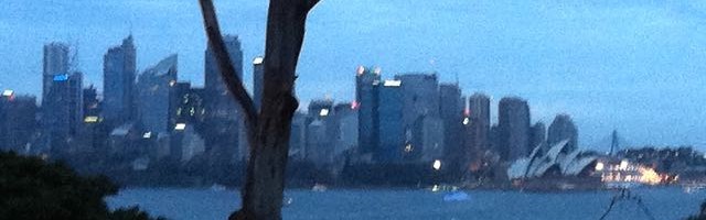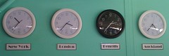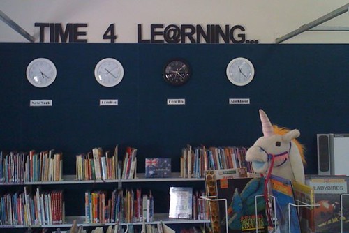
NEW YORK, LONDON, PENRITH, AUCKLAND.
And the ellipsis (…) is extremely important!
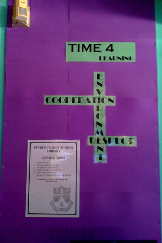
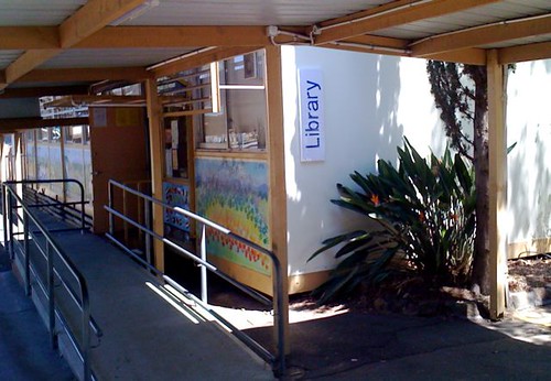
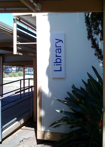
Last week, I finally had the time (ho ho ho) to put up the last major installation in our new BER school library: the “newsroom” clocks with various world time zones represented. This is, essentially, my original vision for the previous library’s back wall, but the beautiful, proposed, professional signage (with purple lettering on a large, clear perspex rectangle, to show the green-painted wall behind) was way out of my meagre, less-than-shoestring, budget at the time. In the old library, I ended up making do with a simple, laminated sign, designed rather crudely in Word, and enlarged on the photocopier on green A3 paper.
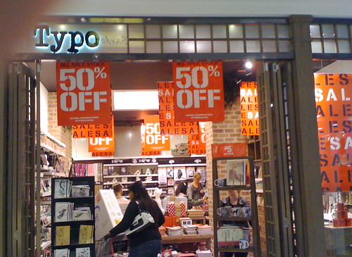
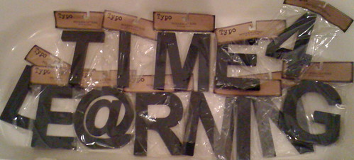
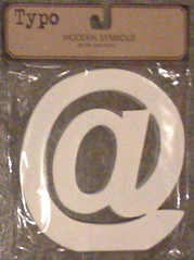
It was a recent, chance discovery of the chain store Typo (in Parramatta, but now also in Centrepoint in the CBD) that secured me the lettering I decided I wanted to do the job properly, and they were pre-painted, and on special! The new library even comes with a ledge – at the right height – for the letters to stand upon, secured lightly to the painted wall with Velcro dots. The ellipsis was an afterthought… While placing the letters last Monday, I had to move a few and the very last Velcro dot removed a tiny bit of paint off the wall, so… I raced back to Typo on Thursday night to get three matching full stops (at 95 cents each). Luckily for me, the first full stop sits over the offending paint glitch. As if it was always meant to be there… (Shhh! Don’t tell anyone I ruined the new wall!)
The black clock (easily recognisable as the local time) doesn’t show up as clearly on dark blue as it once did on pale green, so I superglued a thin, green satin ribbon around its edge, and that helps the rim show up.
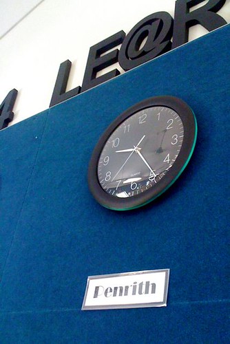
What’s the time in Penrith?
During the rebuilding of our BER, I happened upon some very cool, extra clocks in the shape of Superman‘s insignia and a Doctor Who Dalek, and accumulated those, too, to join the “Time 4 Le@rning” clocks. While in Typo, I also found a very nice, cubic, digital clock for my office (scroll down to final photo); as close to a “Star Trek” stardate clock as I can get at the moment. The “Superman” clock is numberless and the Dalek clock is deliberately “one handed” – and they can be challenging to interpret, but bound to be discussion starters, like so much else in this new library. Almost every artifact has an anecdote and the stimulating environment is getting conversations between students really buzzing.
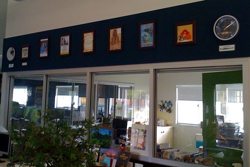
The day I was putting everything up, I realised that six clocks in a row defeats the pun in the signage, so I found new locations for my new, novelty clocks, leaving the “newsroom” part of the library with a more serious tone.
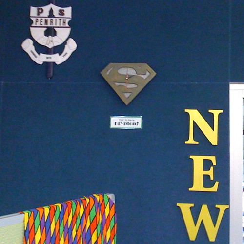
What’s the time on Krypton?
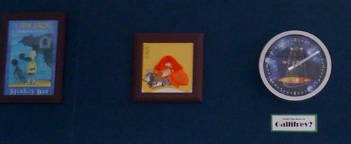
What’s the time on Gallifrey?
The clock with the mouse represents “Hickory Dickory Dock”, of course, and dates back to when the newsroom clocks in the old library began to run down on their first batteries. It took me a while to work out that “Auckland” didn’t need constant repairing and resetting, just a new battery. This old clock, from the original library office, had never kept good time, so now it sits permanently at one o’clock, complete with mouse:
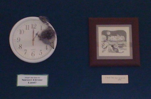
What’s the time in Nursery Rhyme Land?
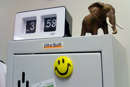
My office clock from Typo. (With Nicholas Ickle’s elephant!)