Library nooks – updates!

It’s time to update my post on reorganising my library nooks, one for Premier’s Reading Challenge (PRC) titles – needing a comfy couch – and another for highlighting new titles – requiring some bright signage!

I finally cajoled a friend with a truck to bring my spare two-seater couch from my front veranda (at home), and then I bought a box of purple Dylon dye to change the colour of an old navy blue and beige lounge throw-over. (In fact, I dyed two matching covers, so I could have cushion covers made for the seating area, since the cover itself often slides off when people slump into the couch.)

Why purple? Well, I still didn’t know what colour to make our main wall, but the library owns an original Kim Gamble artwork in gorgeous pastels, and the professional mounting and frame are mauve and purple, so it was important to decorate around this feature.

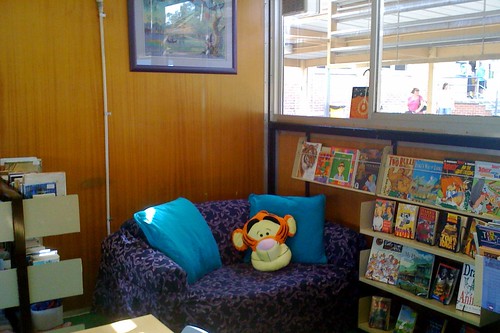
The dye job worked perfectly. On the way home from the city the other night, I found this wonderful Tigger cushion for $15, marked down from $30 (and with a $45 price tag underneath):

PRC nook

I’m thrilled with the way the couch has turned out! The colour match the picture frame perfectly. Now our Stage 2 and Stage 3 PRC titles are with easy grasp of a relaxing place to browse them.

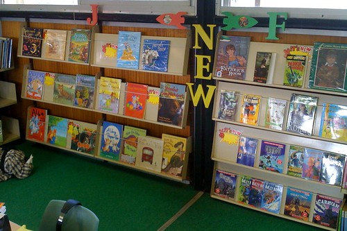
Meanwhile, I spent the school holidays painting and lacquering some more MDF letters to identify the “NEW” titles (in yellow), and the library’s pink “J” (“Junior”) and green “F” (“Fiction”) sections. The left and right “rocket” arrows are actually wooden doorknob hanger signs, templates intended for craft projects. I used old dustjackets to find appropriate book characters to “drive” the rockets, appearing in the hole normally filled by a doorknob.

reno nook for new books

Scattered across the “NEW” titles’ shelves are some die-cut “It’s new” signs. $4 for a packet of ten. My reasoning is that “NEW” shelves are often quickly denuded, so at least the signage will keep the area colourful until the shelves can be restocked.

So where do I put these?

I think it was knowing that I still had a small amount of burgundy paint left that led to this series of brainstorms…

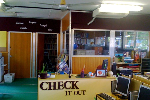
Desk end of library - final

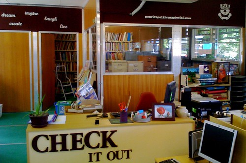
The now-huge, clutter-free area behind the circulation desk (above) has been extremely liberating – and, secretly, we all knew there was simply way too much furniture in this library. I’ve never seen so many storage cupboards, most of them filled with stationery, display materials, boardgames (both complete and half empty), stacks of old encyclopedia volumes (for activities on alphabetical order) and so on. With a captains & prefects investiture due in the library a few days ago, I reluctantly wheeled a very heavy cupboard back from the area where morning tea was to be served, up to behind the circulation desk – and immediately realised that I knew how to make it look like it was supposed to be there!

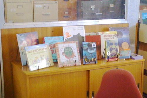
You know all those really expensive picture books, and the pop-up books, and “The Jolly Postman”, with its easy-to-lose tiny letters and postcards, those new, edgy, shortlisted and/or award-winning books, such as Armin Greder’s “The island” and the dark-yet-essential themes of “Dust”, and all those controversial novels (the ones that come with warnings about only using with older students in sensitive, supportive ways, or with the assistance of the local indigenous representatives) that go totally ignored if kept spine-out on a crowded shelf in Teacher Reference, and either ruined or complained about if they are in the main collection or regular Reference! So onto this new benchtop surface, I added… single, front-out book stands and filled them like this:

Display books with woodgrain

With only hours to go before the parents, citizens, captains and prefects arrived for their morning tea in the library – in what would be, for many, the first glimpse of all my changes – I painted the wall segment behind those books with the very last of the burgundy paint. A spectacular effect, I think – a real stand-out, even from the far end of the library, and well worth some comparison photos:

Display books with burgundy

Very satisfying. And the books in the display have caught the attention of every person to approach Circulation in these last days of the school year.

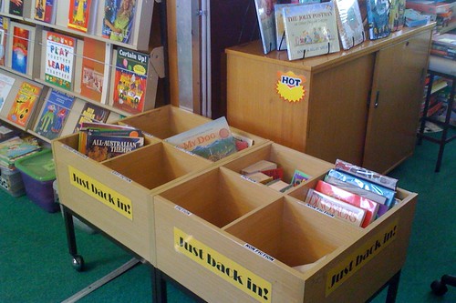
By the way, I’m just loving the phrase, “Just back in”! The new signage, created in Word and laminated over bright yellow paper, denotes the box of yet-to-be-shelved books. The divided interior of each box has always provided compartments for pre-sorting. The idea of “Just back in” came courtesy of one of the schools in Kevin Hennah’s presentation on shoestring library makeovers, and when I first used the signage in the old library, it provided an immediate release of pent-up guilt. Suddenly, books didn’t have to be shelved (too) immediately, because the borrowers often perceive them as “Hot” titles and highly worthy of borrowing before anyone can actually re-shelve them! Thanks for lifting a load, Kevin, with just three little words, so much better than the dire “Returns”. Or “To be shelved”.

"Just back in!" returns boxes - Shoestring makeover

The ABC of URLs

I’m at it again!

There has been considerable mulling going on. While collecting some exciting accolades, both in person and online, I’ve been considering how best to proceed: what bits of the library to work on next – and which will yield maximum returns for minimal outlay?

Considering advice from several people, I decided to splurge another $11.99, at Spotlight, on a second container of the burgundy Derivan Matisse background paint, and to extend the rich splash of colour across the top of the office windows (see below; top right of picture), covering up more of the ugly, varnished woodgrain panelling.
More burgundy

I didn’t end up getting a raw “Before” shot because, up until now, I’ve been avoiding taking this angle from so far back. An ugly piece of thin, grey conduit (leading from a non-functional air conditioner) had been intruding through the airspace, but I was brave yesterday… and I simply removed it. (Last year, an electrical specialist declared Air Conditioner #4 dead. He unhitched one end of the conduit – but some other helpful soul kept restoring the conduit, and/or attempting to switch on the machine.)

Kevin Hennah had suggested, at the recent conference on library design and redesign, that many libraries were now showcasing their URL (of the library’s Internet presence), when creating new signage, and I thought that the far right corner might be balanced with a large white version of the school crest?

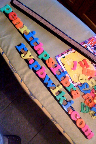
Wandering through a local bargain shop yesterday, I found packets of 26 plastic magnetised letters of the alphabet – for only $2.50 a packet. To get sufficient “i”‘s, I required four packets. Two “j”‘s were forfeited to cut free some full stops for the URL. A spray can of white paint ($13.99) would cover the bright fluoro colours! (And I need some more strong glue, having splurted the last tube all over myself – it must have been faulty at the sealed end.)

But how to mount the letters? I found some long plastic-and-cork “bulletin bars” from Officeworks. At $1.99 each, these were a steal! I’ll be able to fasten the letters securely to two of these plastic bars, and only worry about nailing up the bars, not each individual letter.

Magnetic letters

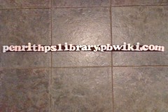
Here’s a test of the white-undercoated plastic letters, spelling out the URL of our school library wiki site, lined up for fit on the two now-burgundy bulletin bars:
URL undercoat

Total cost of this makeover (so far): $39.96 (but lots of paint and little plastic letters left over). Watch this space!

Like… here:

slim url

READ – dream, create, inspire, laugh, live

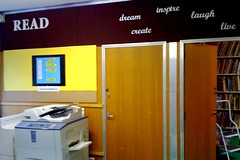
I raced to finish nailing up my new lettering for my library renovation this afternoon, so I could take a photo for the blog, as promised. At 5.55pm, there were still some adjustments to be made but the school cleaners were ready to depart. And then… a reprieve! The Principal was still on site for the monthly P&C meeting, so I had plenty of time to be a perfectionist. (I can’t tell you how many times I was up and down that ladder today.)

So, here’s the grand unveiling:
wallreadreno

Again, Kaisercraft MDF (wooden) letters, from Spotlight, feature. I’d been planning to create several words, perhaps our school’s four core values, from small individual letters; I really wasn’t expecting to find whole words in flowing script (@ $4.99 each). I bought all the words they had in stock. I wonder if they usually stock others? My local Lincraft stocks the individual letters, too, but not the whole words.

I’d failed to consider buying a 250 ml jar of white Derivan “Matisse” while I was there – actually, I assumed these were going to be burgundy, too, until I thought of doing the wall that colour, so a quick trip to a bargain shop in the CBD on Sunday provided me with a $2.50 tube of while acrylic paint instead.

I’m quite thrilled with the result! The library suddenly now has a sleek, yet fun, clean and corporate feel to it. Well, at least when you look in one direction.

Total cost of this renovation: $43.40.

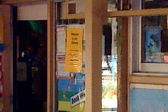
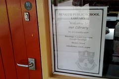
And speaking of a sleek, clean and corporate feel, here’s the first two examples of some new signage created by my library clerical assistant, Louise. Taking to her new assignment with gusto, Louise had heard me talking about Kevin Hennah’s advice on what to do when one simply had to put up some of those ubiquitous laminated signs in the library!

We created a standardised template in Word. Two fonts, as reminiscent of the new MDF lettering on the wall as possible, and with a consistent watermark in the bottom corner of our school logo.

Now any sign, even if only a very temporary “Photocopier out of order”, “Please use other door” or “Meeting in progress” sign, can be made in a matter of seconds and printed out, instead of using a hideous, handwritten scrap of paper, taped or Blu-Tacked to a wall, where it often stays for weeks or months beyond its intended “use by” date.

Hourssigns
There’s really no comparison: wrinkly, ugly, yellow, A3 laminated sign (left) vs fresh and new (right)!

Doorsign

Doorreno
There’s really no comparison: wrinkly, ugly, yellow laminated sign vs fresh and new!

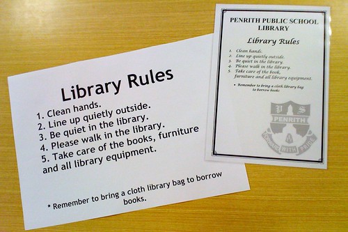
Rulesreno
There’s no comparison here, either: boring A3 set of “Library Rules” (left) vs fresh and new A4 laminated sign (right)!

Total cost to library of template renovation: Nil (using school laminator).

Thanks again, Kevin, for the inspiration and guidance, and thanks Louise for a great job on the template, which will probably get quite a workout over future years. Well, maybe not too much of a workout, eh Kevin?