Meeting a Challenge

We’ve deliberately made the annual Premier’s Reading Challenge (PRC) simpler to administer each year, as more and more students and teachers take up the Challenge.

Our first year, 2006, the teacher-librarian spent a lot of time providing booklets of titles for all students and teachers, parent information notes (very few came back), and little slips that parents also signed-off on for every book read, and we used them to record those titles as they were returned during borrowing sessions. Class teachers maintained paper records for each student, and the T-L did all the data entry. The K-2 (Red) books were placed on a special stand. All PRC levels were labelled with Syba Signs spine stickers. A huge amount of work, but 209 students out of about 400 completed the Challenge. We did note that, for many students, the PRC gave them a buzz about reading, so we considered it all worth the trouble.

In 2007, I returned to a T-L position and we made the parental note an “opt out by signing” form (we already knew that one existing family would be taking that option). The students filled in their own paper records. (No need for the weekly parent slips; either the student is honest about reading the books or they’re not. If anything, the students are going to be more honest than some gung-ho parents.) As T-L, I did all the data entry. 313 students out of about 400 completed the Challenge.

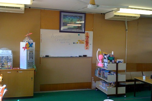
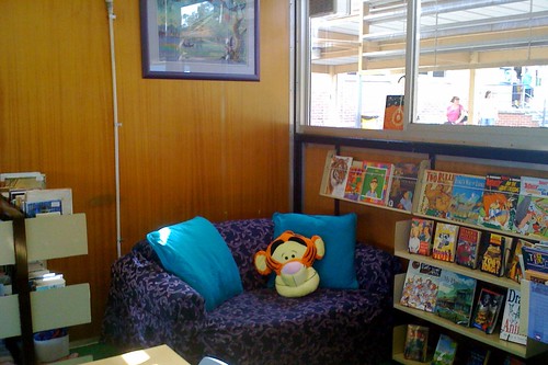
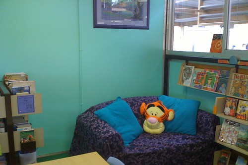
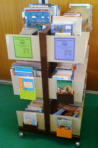
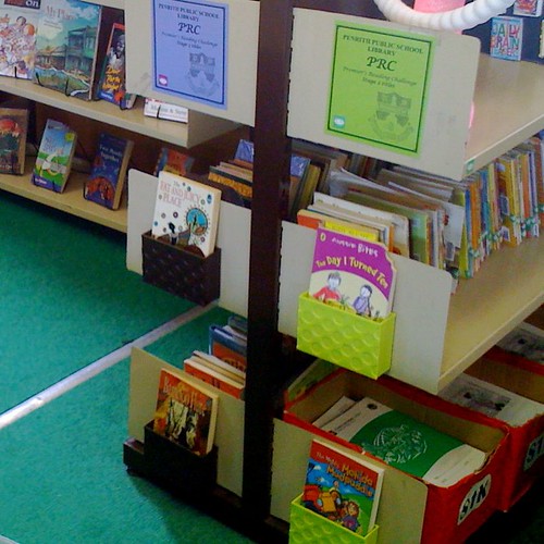
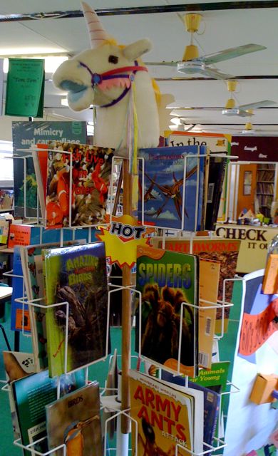
In 2008, the parental note was an “opt out by signing” message in the school newsletter, and the students still filled in their own paper records. I did some of the data entry, but my new clerical is much faster at it, so she helped me whizz through them in no time. I did show students that “soon” they’d be able to access their own records online. Since most of the time they’re reading they are nowhere near a computer, the paper records are still very useful. One of my parent helpers misunderstook my instruction and pulled every PRC book off the regular shelves. I decided, rather than reshelve them in secret, that I’d create a “Green” and “Purple” PRC section of the library. This worked surprisingly well, and will work even better when OASIS locations match properly in OASIS Enquiry. 329 students out of 410 completed the Challenge, and three students, who’d started PRC at previous schools, received their Gold Certificate from our State Government representative!

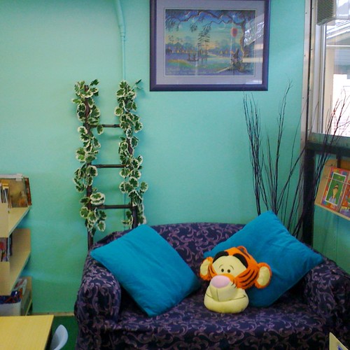
In 2009, the “Green and purple” PRC section of the library now has a comfy purple couch against a green wall, as part of our ongoing library makeover. I’ve still made hardcopy student booklets of titles; the paper for doing this is part of our Priority Schools Program (PSP) funding, with the Challenge an intrinsic part of the school’s literacy programs. I’m hoping the students will enter their own books online this year, and I’ll only have to do the K-2 classes (copied records from each teacher’s master list) and acknowledge the 3-6 entries online. We have many students aiming for their gold certificate in our fourth year of running the Challenge here. Again, the PRC still gives most of the students a buzz about reading, so we consider it all worth the trouble. We are aiming at 100% participation this year.

Library lovers in new surroundings

Today, the staff celebrated Library Lovers’ Day, a concept promoted by ALIA (Australian Library & Information Association), a fledgling tradition now in its second year here.

Essentially, it was just a good excuse to throw the staff a bonus morning tea, this time in the new surroundings of the recently revamped library, and to take in the cumulative effects of the “shoestring makeover”. I’m really loving that the “desks end” of the library is the calming mint green end, and the “Check it out” end is all corporate burgundy.

Last year, I promoted OASIS Web Enquiry and “Scan” on Library Lovers’ Day. This year we just ate, drank and were merry. Edible goodies included ye olde Conversation heart-shaped sweets and some cute heart-shaped biscuits. The new peace lily took pride of place as a table setting, complete with little heart-shaped picks “growing” from the plant.

We’re just loving out “new” school library.

Going green

peace lily

There’s an annoying drip of condensation that often falls from each air conditioner in the school library, and something important always ends up getting placed right underneath said drips, and being ruined. I’m getting very tired of items becoming water damaged. Thus, this elegant $12 peace lily (Spathiphyllum), in a $13 square pot, now graces one of the drip sites. Problem solved?

I’m reliably informed – via both a teaching colleague and an Internet search – that “growing a peace lily beside a computer or TV will help absorb some of the radiation”.

Ladder and vine

Again, helping to disguise yet another drip site, and some very ugly conduit, here’s a $29 bamboo ladder, decorated with a $10 artificial vine, and a vase of $5 worth of purple tortured willow. A small amount of dried greenery is yet to be added.

“I’m ready for my IWB, Mr DeMille…”

reno back wall - painted green

You know what? This has been the hardest blog entry to write – ever!

I completed the paint job on the back wall on Thursday afternoon, hung around after school for the paint to be dry enough to remove the masking tape from all the edges, re-adjust the couch’s purple cover and push all the furniture back into position, and then had to head into the city. Although I was exhausted from Wednesday’s undercoating (mineral turps cleanup, ugh!) and the Thursday’s two coats of semi-gloss (water-based), I did have photos to share, but something was stopping me.

Here it is Sunday afternoon already, and I’m still dragging the chain. Since this is probably the end of the current wave of shoestring makeovers, and normal classes start in the library on Monday, maybe I’ve become too attached to the renovation process? But I must… share! 😉

Why green? Well, I picked an obviously contrasting colour from the beautiful purple-framed Kim Gamble artwork I’d decided to decorate around. And our carpet is already the medium green school carpet. The Taubman’s Living Proof Silk green paint tint is actually called “Coral Fantasy”. The closest match I found to the existing purple frame, in case I need to paint anything purple in the future, is called “Tyrian Purple”.

In any case, the back wall started like this:

Busy back wall

and ended up like this:

stripped wall

Holes filled

reno back wall - painted green

Some plants, both artificial and natural are still to come, but… I’m sooooooo ready for that IWB to arrive!

Clocks x 4
NEW YORK, LONDON, PENRITH, AUCKLAND.

I loved the “newsroom clocks” idea, from a secondary school renovation in Kevin Hennah’s presentation last year, and I wondered if it was appropriate for a primary school. Or just too confusing? On my visit to Spotlight last year, I bought MDF letters for the signage on the opposite wall. When price-checking my purchases at the nearby rival store, Lincraft, I noticed they had three large white clocks on special for just $9.95 each. I’d already figured I needed four. Then I noticed they had a few of the same model in black – but again, not four. Brainstorm! I realised: even students who can’t read should be able to tell that “Penrith” time is on the black clock! (Well, okay, if they can’t read they probably also can’t tell the time, but you get the idea!)

iPhone world clocks

By the way, my iPhone has a “world clocks” application, which I have adjusted to match the order of the library clocks!

Core values

This was my Friday afternoon very-shoestring solution to a problem. When the school assistant helped me remove all the pinboards that were covering this wall, this last one was not able to be unscrewed, because the school’s burglar alarm system is bolted through the board. I did intend this section to have some MDF letters, perhaps in purple, to spell out our four core values, but I was also concerned I was going overboard with MDF lettering. Could I perhaps try a more economical piece of signage on the laminator, as a placeholder until it’s proven the area needs something more permanent?

On top of this, people kept asking me if Kevin Rudd was giving us a brand new library, and therefore why was I still redecorating the old one? So, anyway, here’s my quick solution: purple cardboard to cover the annoying old pinboard, and some laminated core values. The “TIME 4 learning” at the top is a small version of what I planned to have, as a vinyl-lettering-on-3D-perspex sign, under the four clocks. Until the IWB arrives, I really don’t want to tempt fate. Yet.

Note the white “Library rules” sign, which we made last year on our special library signage template. On Friday I also took down the matching “Closed for stocktake” signs. There are also red, green and purple “Premier’s Reading Challenge” laminated signs in appropriate places.

Oh, and the new coloured-pencil containers on the desks? I figured those old hessian- and/or Contact-covered cat-food tins from the 70s had outlived their usefulness. The new Accent Concepts containers (below right) are $3 each, in both purplish-blue and black, (and a pinkish shade for lead pencils). From Hot Dollar:

pencil containers

And the couch corner goes from this:

PRC nook

to this:
purple couch, Tigger, green wall

My special thanks to parent helper, Laura, who braved what is now known as Thickening Paint Thursday, – especially when we had to turn off the two nearest air conditioners because condensation was running down the outside of the ugly conduits we were so desperate to disguise the same green colour as the wall to which they were screwed!

Thoughts from a ladder

I was undercoating a large wall of the school library today, and it was hard work. The undercoat is a high quality, very thick type, made to cover tricky porous stuff such as the wood panelling with which this portable library is lined. Hungry, hungry wood, and the oil base of the undercoat means that cleanup is going to be messy and, umm, turpsy. I was up on the ladder most of the day, using a brush rather than risk clogging up the roller I need for tomorrow’s two paint coats, so I had lots of time to ponder things.

I had a steady stream of observers, several of whom wanted to ask if I’d heard the news that “Kevin Rudd is giving out library upgrades” – and therefore was all my shoestring renovating for naught?

“Aha!” I said, several times. “That’s why I secured all my MDF letters on the walls with nails, not glue!” If the collection is moving to a new venue somedaysoon, then my renovations are coming too.

Another colleague asked tonight, on Facebook if spending in education should mean more teachers, not buildings?

Mmmmm. I suggested that if she could see the irreparable leaks in the cramped portable library I work in, and its threadbare green carpet, and rickety shelves (that tremble when I hurry to answer the telephone), maybe she’d vote “new building”, not more teachers?

We do some amazing work in this library, but a purpose-built venue, with modern fittings would be even more amazing. With or without my current renovation enhancements. This type of stuff – ie. earmarking tied government grants – always needs to be considered on a case-by-case basis. Not everyone needs the same things. In any case, if the Federal goverment suddenly gave my school extra teachers, we’d have nowhere to put them, or their classes!

So yes, I’d say “I’ll take the new library!”… If one is ever offered.

Similary, another colleage wondered why many Australian schools don’t have a web page for their library, even when the school itself has an Internet presence.

I created our school’s website in 2002 and 2003, or rather, I headed the committee to decide what needed to be on it, and did the HTML that made the site work. But this was before I was the school’s teacher-librarian. We ended up putting in some images of Book Week displays on a library page, but not much else. The school web site is quite extensive, but desperately in need of updating.

Since moving into the library in 2007, I’ve also created a school library wiki site, where we publish jointly constructed texts created during library sessions, but I simply haven’t had the time to brainstorm an actual library web page.

When I’ve talked to my teacher and student library users over the years, they’ve described access to OASIS Library as the most valued aspect – and, since the end of 2007, all NSW DET OASIS schools can access their library’s catalogue online, via the teacher portal or Kidspace, and can even do so at home.

So there’s still never been much of a burning need to create a dedicated “web page” for the school library. I guess we could add opening hours, etc. When our interactive whiteboard (IWB) arrives in a few weeks I can imagine other urgent uses for one. But this blog site usually has the links I use with students on any given day. Not to mention my shoestring makeover progress reports.

But yes, maybe I do need a “library web page”… But first, I have to stir this can of green paint. At least it’ll match our fraying carpet.

Front-on displays – rules of attraction!

I’ve put a lot of thought into Kevin Hennah’s urging that librarians and teacher-librarians take note of how shops promote the books (and other goods) they wish to sell quickly: they have the beautiful covers turned out to face the customers. Most libraries have the spines out: to save room, to save reshelving time, and to make it easy to locate books by their call numbers. And shops maximise the use of the ends of their rows of shelves.

Since many students come to the library to browse, maybe strict Dewey order and “spines out” is not the most user-friendly strategy?

Slant boards seemed to be a great way to maximise the use of shelf ends, for covers-out displays, in the libraries shown in Kevin’s slideshow presentation. But I imagine these slant boards are very expensive, and our school library doesn’t have all that many exposed shelf ends anyway.

I’ve had a picture in my mind of something sturdy enough to withstand students (I’ve seen plenty of fragile, perspex, document holders), and yet it can’t require more painting for my wearing-out wrists. Yesterday, I found a fascinating selection of Japanese homewares:

* plastic (and very strongly magnetic) Magnet Pockets (in the colours of dayglo lime, dayglo orange and brown)

* two sizes of Sukitto white plastic baskets, which can be suspended by plastic hooks.

Each of these pieces: only $3 from Hot Dollar.

Boxes and baskets

The magnetic boxes fitted perfectly on the Premier’s Reading Challenge shelf ends, and the boxes easily take the mass of a paperback book:

magnetic display boxes

After taking this picture, I found one more lime box left in the shop and was able to improve my colour coordination a bit. (Actually, this one was wrongly price-ticketed and I was charged only $2.50.) The orange boxes are now being used in another section of the library, coicidentally this was the colour I’d be using in “Non Fiction”, remember? I’m contemplating spray-painting the brown boxes PRC purple, but the brown does match the shelving frames.

PRC magnetic boxes 2

This long white basket hangs from the otherwise-exposed (and completely wasted) back of a huge wire book rack. The basket can supposedly hold ten kilograms of books:

rack basket

These smaller white baskets fill an otherwise-dead corner of “Junior Fiction”, right near the front door!

book baskets

So, until there’s money to fritter away on purpose-built wooden slant boards, these nifty Japanese baskets will at least get us thinking more like a shop, and hopefully more browser-conscious than reshelver-conscious.

The other simple “front-on” success was choosing to stock this spinner rack with vibrant “animal books” – I find it’s almost impossible to keep it restocked! The students gravitate towards the rack, and it’s often picked clean! I have several students who love to come in at lunchtime and restock it.

Spinner rack of animal books

Likewise, this “Hot” spinner rack of “Aussie bites”, “Aussie nibbles” and “Aussie chomps”:

"Hot" rack of "Aussie bites" books

Library nooks – updates!

It’s time to update my post on reorganising my library nooks, one for Premier’s Reading Challenge (PRC) titles – needing a comfy couch – and another for highlighting new titles – requiring some bright signage!

I finally cajoled a friend with a truck to bring my spare two-seater couch from my front veranda (at home), and then I bought a box of purple Dylon dye to change the colour of an old navy blue and beige lounge throw-over. (In fact, I dyed two matching covers, so I could have cushion covers made for the seating area, since the cover itself often slides off when people slump into the couch.)

Why purple? Well, I still didn’t know what colour to make our main wall, but the library owns an original Kim Gamble artwork in gorgeous pastels, and the professional mounting and frame are mauve and purple, so it was important to decorate around this feature.

The dye job worked perfectly. On the way home from the city the other night, I found this wonderful Tigger cushion for $15, marked down from $30 (and with a $45 price tag underneath):

PRC nook

I’m thrilled with the way the couch has turned out! The colour match the picture frame perfectly. Now our Stage 2 and Stage 3 PRC titles are with easy grasp of a relaxing place to browse them.

Meanwhile, I spent the school holidays painting and lacquering some more MDF letters to identify the “NEW” titles (in yellow), and the library’s pink “J” (“Junior”) and green “F” (“Fiction”) sections. The left and right “rocket” arrows are actually wooden doorknob hanger signs, templates intended for craft projects. I used old dustjackets to find appropriate book characters to “drive” the rockets, appearing in the hole normally filled by a doorknob.

reno nook for new books

Scattered across the “NEW” titles’ shelves are some die-cut “It’s new” signs. $4 for a packet of ten. My reasoning is that “NEW” shelves are often quickly denuded, so at least the signage will keep the area colourful until the shelves can be restocked.

Daisy Sunshine – in the sunshine

Susanne Gervay book launch
On yet another of Sydney’s string of very warm days, I was off on the train into the city this afternoon, alighting at Central for a brisk, if very sweaty, walk along ever-colourful, if now slighty worn-down, Oxford Street, through Darlinghurst, Paddington and then Woollahra, to the beautiful and stately Hughenden Boutique Hotel!

I had been invited by author Susanne Gervay to attend the launch of two “Making Tracks” books for children: Felicity Pulman‘s “Turning the Page” and Susanne’s own “Daisy Sunshine”. These are the final two titles in a series published by the National Museum of Australia, with each fiction book highlighting an artifact from the Museum’s amazing collection of significant, historic Australiana.

Because Susanne’s book is set squarely in 1975, and focused around some feminist memorabilia of that decade, there was a pervasive presence of cork platform shoes, long dresses, hippy headscarves, and a rousing chorus of “I Am Woman”.

It was fun hobnobbing with the members and friends of the Society of Children’s Book Writers and Illustrators of Australia, and renewing many old acquaintances. A great way to spend a lazy Sunday afternoon.