The “What drives me crazy and how can I fix it immediately?” method

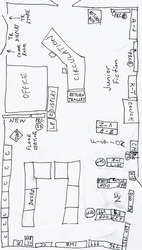
Recently, on the TL listservs, we were asked to comment on how we displayed series titles, and how we decided which series would become designated special sections and which would be interfiled with the main collection. I decided I usually use the “What drives me crazy and how can I fix it immediately?” method.

At this school, “Where’s Wally?” books are almost-always out on loan, or if they are “in”, they are all off the display and being read at lunchtimes. In the new library, I have a special, decorated shelf for “Where’s Wally?” books.

I found Wally, er, Waldo

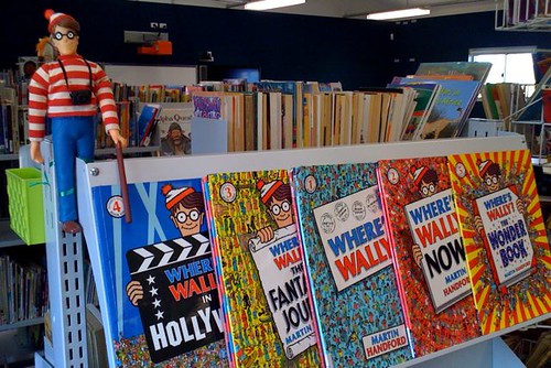
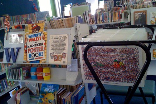
Thanks to a bit of laminating (the cover of an old “Where’s Wally: the magnificent poster book”) and a big, blue-painted MDF “W” from Spotlight (or Lincraft), the display still looks good even if every Wally book is “out”:

Where's Wally? poster rack

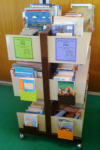
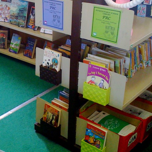
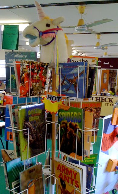
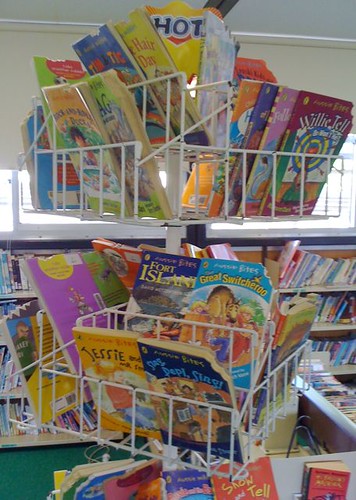
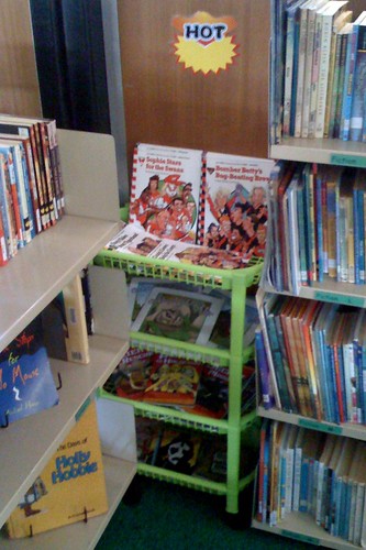
“Quick Reads” are on a spinner rack and include a pot pouri of “Aussie bites”, “Aussie nibbles”, “Aussie chomps”, “Skinnys”, “Solos”, “Out of this world”, “Hotshots”, “Crazy tales” and “Billy Kool”, etc.

Displays

Our three levels of “Premier’s Reading Challenge” books are also in their own sections.

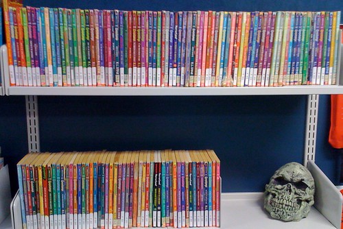
In the old library, the previous TL was driven crazy by the popularity of “Goosebumps”, so I created a dedicated shelf in Fiction for Stine’s “Goosebumps” series, mainly because otherwise the frantic rummaging for those titles made a complete mess out of the regular “S” shelf. The dedicated display was actually on an empty “G” shelf, but in the new library, “Goosebumps” (more were donated!) take up two whole shelves called “STI – Goosebumps”, situated between the “R” and “T” shelves, and decorated by a hideous, life-sized, Halloween skull.

Goosebumps skull

In my previous two libraries, we had dedicated sections for “Dr Seuss” books and “Choose-Your-Own Adventures”, because those books were extremely popular at the time.

A quick & dirty mud map

I’ve been asked to help other teacher-librarians, about to move into their new BER libraries, to provide a “mud map” of the floor plan, showing the arrangement of the shelving bays and where our Junior Fiction, Fiction and Non Fiction sections start and end.

Library floor plan mud map
(Click to enlarge.)

The Key is:
C = Computers
CC = Connected Classroom
IWB = Interactive WhiteBoard
LP = Listening Post
PRC = Premier’s Reading Challenge
R = Reference
SPIN = Spinner Rack (one for Animal NF and one for Fiction Quick Reads)
TR = Teacher Reference.

Junior Fiction goes from the returns box to the couch, (Senior) Fiction follows in two “U” shapes, Non Fiction follows in two “U” shapes and finishes at IWB. I realised before unpacking that we really didn’t have enough shelves, so I marked my three targets (ie. JUN Z, FIC Z and NON 999), bit the bullet and just culled ruthlesslessly to fit. I am now very glad to have been that brave. We probably culled about a quarter of a very bloated collection. I know that borrowing will increase as a result of this drastic spring clean. Had I tried to cull in the old library environment, I’m sure I’d have kept a lot of unnecessary stuff.

As you can see, I essentially accepted the arrangement offered by the builders, only switching the positions of a browsing table with a set of bench seating, and sliding one bay slightly to accommodate. The two spinner racks – one for Quick Read, such as “Aussie bites”, etc and one for colourful animal books – plus the racks for Premier’s Reading Challenge, were retrieved from the classrooms where they were on long-term loan.

Into the archives!

Cassandra Golds' presentation plate

Cassandra Golds was here! The donated book was John Burningham’s “Around the world in 80 days”. Children’s author, Cassandra Golds, was once a student at our school and this book was found during the reshelving of the 800s section today! Saved from the cull! The book plate was affixed to “Around the world in 80 days” by John Burningham.

"Around the world in 80 days" cover

BER – the second tour!

Today, the whole staff was given a walk-through of our school’s almost-completed new BER double-classroom and new BER school library. These are some comparison photos with the ones from my sneak preview of the library a few weeks ago:

Library - external

Library - external 2

Library - main doorway

Library - main doorway 2

Library circulation

Library circulation 2

Library office

Library office and storeoom 2

Library - internal

Library - internal 2

Library exit

Library exit 2

Down the other end of the school, a matching building, comprising a modern double classroom, with wet areas, storerooms and a glassed-in, shared withdrawal teaching space, is almost complete! On the floor is stored some of the shelving and furnishings for the library!

Furniture

Shelving

Mmmm, back at the library… Mind that last step: it’s a doozy!:
Green door
As a colourblind man, I must trust my colleagues as to the colour of this door. But it’s hard to miss, whatever colour it is!

I can’t wait to get all the books and other resources out of storage. There was no time to cull books before packing (done by professional removalists, supervised by me), so I anticipate a massive and essential cull during the first few weeks of set-up.

Be brave! Go front-out!

A colleague over on the OZTL_Net listserv asked about making her high school library look more like a bookshop, with more of the book covers facing outwards to entice readers. She specifically mentioned those old brown library shelves, with their stodgy, flat canopies, and her unsuccessful efforts to use them as display areas. Does putting an angled display shelf in its place mean overcrowding below?

Sure, I said, if that’s all you can manage to do, it’s better than nothing. But I also suggested combining her new arrangement with a savage cull of old books. Crowded spine-out shelves are very uninviting, and it’s the front-out books that will be moving, while the spine-out books will no doubt get ignored by most browsers. There’ll be less books, but the borrowing figures will surely rise!

Kevin Hennah, at the wonderful PD day I attended in 2007, heartily recommended ridding all libraries of their antiquated, flat-top canopy shelves. Wherever possible, he suggested shelving that encouraged front-on displays. There are some library furniture catalogues around that have beautiful box-shaped tubs, rather like the old-style LP record bins, for picture books and large format, fully-illustrated non fiction.

In libraries with very limited space, or limited budgets, he recommended slant boards (even homemade), that could cover plain, unused shelving bay ends and turn them into attractive display spaces for cover-out books. In my primary school library, I had to be even more frugal. I knew we couldn’t justify spending money on slantboards – but I found a range of Japanese plastic wares in a chain of stores (called Hot Dollar), such as hooked baskets and funky, colourful, little magnetic boxes. I also made much better use of two existing spinner racks – it’s impossible to keep them filled! Front-on displays make books *move*!

Even assemble-it-yourself wheeled plastic trolleys, also from a “two dollar bargains” store, filled little corners of the library with useful front-on display space. I swapped the slanted display shelving of several old portable magazine racks to convert a set of standard wall shelves into display shelves. Click here for more amazing results!

Can you tell I’m just itching for my new library to be built?

Front-on displays – rules of attraction!

I’ve put a lot of thought into Kevin Hennah’s urging that librarians and teacher-librarians take note of how shops promote the books (and other goods) they wish to sell quickly: they have the beautiful covers turned out to face the customers. Most libraries have the spines out: to save room, to save reshelving time, and to make it easy to locate books by their call numbers. And shops maximise the use of the ends of their rows of shelves.

Since many students come to the library to browse, maybe strict Dewey order and “spines out” is not the most user-friendly strategy?

Slant boards seemed to be a great way to maximise the use of shelf ends, for covers-out displays, in the libraries shown in Kevin’s slideshow presentation. But I imagine these slant boards are very expensive, and our school library doesn’t have all that many exposed shelf ends anyway.

I’ve had a picture in my mind of something sturdy enough to withstand students (I’ve seen plenty of fragile, perspex, document holders), and yet it can’t require more painting for my wearing-out wrists. Yesterday, I found a fascinating selection of Japanese homewares:

* plastic (and very strongly magnetic) Magnet Pockets (in the colours of dayglo lime, dayglo orange and brown)

* two sizes of Sukitto white plastic baskets, which can be suspended by plastic hooks.

Each of these pieces: only $3 from Hot Dollar.

Boxes and baskets

The magnetic boxes fitted perfectly on the Premier’s Reading Challenge shelf ends, and the boxes easily take the mass of a paperback book:

magnetic display boxes

After taking this picture, I found one more lime box left in the shop and was able to improve my colour coordination a bit. (Actually, this one was wrongly price-ticketed and I was charged only $2.50.) The orange boxes are now being used in another section of the library, coicidentally this was the colour I’d be using in “Non Fiction”, remember? I’m contemplating spray-painting the brown boxes PRC purple, but the brown does match the shelving frames.

PRC magnetic boxes 2

This long white basket hangs from the otherwise-exposed (and completely wasted) back of a huge wire book rack. The basket can supposedly hold ten kilograms of books:

rack basket

These smaller white baskets fill an otherwise-dead corner of “Junior Fiction”, right near the front door!

book baskets

So, until there’s money to fritter away on purpose-built wooden slant boards, these nifty Japanese baskets will at least get us thinking more like a shop, and hopefully more browser-conscious than reshelver-conscious.

The other simple “front-on” success was choosing to stock this spinner rack with vibrant “animal books” – I find it’s almost impossible to keep it restocked! The students gravitate towards the rack, and it’s often picked clean! I have several students who love to come in at lunchtime and restock it.

Spinner rack of animal books

Likewise, this “Hot” spinner rack of “Aussie bites”, “Aussie nibbles” and “Aussie chomps”:

"Hot" rack of "Aussie bites" books

A basketful of solutions

In the madness that is Term Four stocktake, I had several brainwaves and lucky coincidences that enabled me to complete several new shoestring elements to my school library makeover.

Those tiny books that some young borrowers covet like long-lost treasures! They slip inside other books, fall under shelving, cause whole rows of neatly shelved books to go wonky. How to store them efficiently?

In one of my previous schools, we had a spinner rack that accommodated all small junior fiction books. I hated that spinner, but those books were always hot picks! At least the spinner made them easy to identify, easier to shelve, and put them all on front-on display, in a place where the students were motivated to go.

At the course last term, Kevin Hennah challenged us to investigate ways to make more of our library collections face “front cover out”, rather than “spine out”. One day, I was wandering through a local Asian “two dollar” shop and found a vibrant pink plastic set of tiered baskets. At $16, it was certainly more than other items in the store, but the pink was the same colour the previous teacher-librarian had assigned to shelf signage in the “Easy Fiction” section. Now, I’d been contemplating changing “Easy” to “Junior”, although I wasn’t sure how to tell my clerical assistant that we’d eventually be changing a lot of call number stickers, but the students are very familiar with the pink designation for this section.

hot pink basket

It was a tight fit between two shelving units, but no one’s likely to move the tiers, and what a great way to maximise some dead space, put all the tiny books in one convenient location – front on – and add a splash of day-glo colour!

Coincidentally, another colour the shop had in stock was green, the colour of our “Fiction” section. The next day, I raced back to get the last green set left in stock:

hot green basket

This time, the shelving units I’d planned to wedge the baskets between were too close together and unable to me moved apart. So, I dragged a different set out from a wall, wedged the backets beside it, and slide the shelves snugly against the baskets. Charged with success, I went back for an orange set to put in the “Non Fiction” section:

reno dragon and hot orange basket

To the left is a papier-mache Chinese dragon from my classroom teacher days, and he’s become a bit of a mascot in the library in recent years. Kevin Henneah would probably say that his time as come; I had to bring him down from his usual high corner, to make room for the wall-preparation renovations anticipating the arrival of our new interactive whiteboard (IWB). We had a stack of unused shelving packed tightly against a wall and, until the dragon gets a better location, he seems quite at home next to the baskets of small books of myths and legends in “Non Fiction”.

Finally, note the “Hot” signs above each basket, which came from a different Asian “two dollar” shop, this time in the Sydney CBD. The packet of ten cardboard showcards was just $4. Also available was a set with “It’s New!” Thanks Hot Dollar – both of your stores! My shoestring is stretched but still intact!

So where do I put these?

I think it was knowing that I still had a small amount of burgundy paint left that led to this series of brainstorms…

Desk end of library - final

The now-huge, clutter-free area behind the circulation desk (above) has been extremely liberating – and, secretly, we all knew there was simply way too much furniture in this library. I’ve never seen so many storage cupboards, most of them filled with stationery, display materials, boardgames (both complete and half empty), stacks of old encyclopedia volumes (for activities on alphabetical order) and so on. With a captains & prefects investiture due in the library a few days ago, I reluctantly wheeled a very heavy cupboard back from the area where morning tea was to be served, up to behind the circulation desk – and immediately realised that I knew how to make it look like it was supposed to be there!

You know all those really expensive picture books, and the pop-up books, and “The Jolly Postman”, with its easy-to-lose tiny letters and postcards, those new, edgy, shortlisted and/or award-winning books, such as Armin Greder’s “The island” and the dark-yet-essential themes of “Dust”, and all those controversial novels (the ones that come with warnings about only using with older students in sensitive, supportive ways, or with the assistance of the local indigenous representatives) that go totally ignored if kept spine-out on a crowded shelf in Teacher Reference, and either ruined or complained about if they are in the main collection or regular Reference! So onto this new benchtop surface, I added… single, front-out book stands and filled them like this:

Display books with woodgrain

With only hours to go before the parents, citizens, captains and prefects arrived for their morning tea in the library – in what would be, for many, the first glimpse of all my changes – I painted the wall segment behind those books with the very last of the burgundy paint. A spectacular effect, I think – a real stand-out, even from the far end of the library, and well worth some comparison photos:

Display books with burgundy

Very satisfying. And the books in the display have caught the attention of every person to approach Circulation in these last days of the school year.

By the way, I’m just loving the phrase, “Just back in”! The new signage, created in Word and laminated over bright yellow paper, denotes the box of yet-to-be-shelved books. The divided interior of each box has always provided compartments for pre-sorting. The idea of “Just back in” came courtesy of one of the schools in Kevin Hennah’s presentation on shoestring library makeovers, and when I first used the signage in the old library, it provided an immediate release of pent-up guilt. Suddenly, books didn’t have to be shelved (too) immediately, because the borrowers often perceive them as “Hot” titles and highly worthy of borrowing before anyone can actually re-shelve them! Thanks for lifting a load, Kevin, with just three little words, so much better than the dire “Returns”. Or “To be shelved”.

"Just back in!" returns boxes - Shoestring makeover