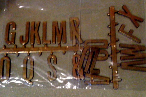
This $2.00 packet of metallic gold, adhesive letters (from a $2 shop, of course) provided inspiration for the past weekend’s project. I had decided that a version of our school badge – perhaps in three dimensions and in colours of white and burgundy ? – might be the most suitable design piece for the large blank, burgundy space above the windows of the library office, and a counter balance for the big “READ” sign in the far corner. When I saw these letters, I realised that “P E N R I T H” would actually be perfect scale to the photocopy of the school badge I’d enlarged to A3 earlier in the day.

On Saturday morning, I noticed that I’d left my A3 pattern at work/school, so out came the trusty ruler and pencil and I enlarged the small photocopy I did have.
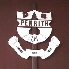
I still had a spare Officeworks‘ plastic and cork “bulletin bar” (at $1.99), so I painted this burgundy and incorporated the shape so it would support the two main sections of shield and scroll, and might even give the illusion of a three-dimensional shaft section of the rocket which blasts off from our school badge (originally designed in the late 60s inspired by the 1969 NASA moon landing, I understand). The first version of the badge was in yellow and brown, the old school uniform colours, but it’s been red, white and blue for many years now, and simply black and white on letterheads, etc. I wasn’t changing the school colours here, but a rendition of the b/w badge using white and burgundy as the contrasting colours.
From Eckersley’s art supply store, I bought an A2 sheet of layered 5mm foamboard (@ $4.95), but I still have a lot, equivalent to A3 size, left over. These foamboards are more sturdy and resilient than cardboard, and come in numerous colours. I found a distinctively off-white variety, and a pure white one. Since the white lettering I’d been painting these past few weeks is lacquered, and isn’t really a stark white, the off-white foamboard seemed the best choice.
A Stanley knife was used to cut out the shapes I needed. The rocket became a cut-out hole, while the scroll had extra shapes to bring some parts into the foreground. The letters, plus two spare magnetic letters (ie. in the same font as the URL signage), were painted burgundy, lacquered with matt varnish, and glued into place. The school motto is a print-out from the computer. Essentially, the finished design is in four layers, and should cast some interesting little shadows.
My main concern was that it had to look classy, but it also had to be cheaper than a commissioned styrofoam sign from a professional signwriter.
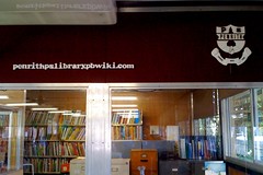
This morning, I used nails to secure the three plastic strips to the wall. In case we ever get a new library built one day, I’m planning to take all my handiwork with me! Because the library’s closed for stocktake this week, there has been very few visitors and I’m anxious to show off my latest handiwork.
The grey, soft-covered piping that emerges from the air-conditioner and connects to conduit is still giving me grief. I’m not game to paint it, in case the plastic-like material repels the paint. Maybe I’ll try wrapping it in burgundy ribbon? Happily, the ugly grey conduit disappears against the wall when covered in the burgundy paint.
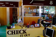
The more we do to improve the look of this end of the school library, the more we reveal of the huge windows… and the mess beyond. My clerical assistant has been extremely busy removing my untidy “piles of stuff” from the tops of each vertical filing cabinet. Thanks Louise!
Total cost of this makeover: Add another $8.94 to last week’s $39.96 and you’ll get $48.90. I think. 😉